
TL;DR
Your static contact form is often the main reason visitors abandon your site. By simplifying fields, using smart design, and adding multi-step logic, you can triple your conversions without extra traffic. Fixing your form is a quick, high-impact way to grow leads fast.
Ever notice how most contact forms feel like a chore? You spend hours driving traffic, then lose the customer at the last second — not because they’re uninterested, but because your form feels like a barrier. It’s the silent killer of your conversion rate.
Here’s the truth: the form isn’t just a simple detail. It’s the final gatekeeper. And if it’s not optimized, you’re leaving hundreds of potential leads on the table every month. Today, I’ll show you why your contact form is underperforming and how a few tweaks can turn it into a conversion machine.
Key Takeaways
- Reducing form fields from 11 to 4 can increase conversions by over 160%.
- Ask only for essential info—email first, phone later if necessary.
- Design and mobile friendliness have a direct impact on form success.
- Breaking forms into steps and using logic makes visitors more willing to complete them.
- Implement lead scoring to focus your team on hot prospects, not cold leads.

MAIL.ME: Speed Clone: inspired by the popular plugin Contact Form 7 (Speed Clones Book Book 1)
As an affiliate, we earn on qualifying purchases.
As an affiliate, we earn on qualifying purchases.
The brutal truth: static forms kill your leads faster than you think
Static contact forms—those boring, one-size-fits-all pages—convert only about 2.9% of visitors across all industries. That’s roughly 97 out of 100 people leaving without a word. This high abandonment rate is largely because these forms fail to engage or adapt to the visitor’s intent. They treat every visitor the same, regardless of context, which leads to frustration and drop-offs.
Well-designed multi-step forms, on the other hand, break down complex questions into manageable chunks, making the process feel less daunting. They also allow you to tailor questions based on previous answers, which increases relevance and engagement. This targeted approach reduces cognitive load and makes completing the form feel like a personalized experience rather than an obstacle.
By understanding that static forms are a one-size-fits-all solution that ignores user psychology, businesses can realize why these forms are a leaky funnel. Moving to dynamic, interactive forms is not just a design upgrade; it’s a strategic shift that directly impacts your bottom line by capturing more leads and reducing bounce rates.

280Pcs Sandwich Dual Nail Forms – 14 Sizes Oval Shape for Builder Gel, Reusable Full Cover Nail Extension Molds for Professional Salon & Home DIY
【2026 Advanced Sandwich Dual Forms】Revolutionary dual-layer extension system delivers salon-perfect results every time. This innovative sandwich technology ensures…
As an affiliate, we earn on qualifying purchases.
As an affiliate, we earn on qualifying purchases.
Why asking for too much kills your chances
Ever filled out a form that demanded your entire life story? That’s a quick turnoff because it triggers a mental barrier. When visitors see a long list of questions, especially if they seem unrelated or unnecessary, they perceive the effort as too high. This perceived effort increases cognitive load—meaning their brain has to work harder to complete the task—and often results in abandonment.
Research shows that reducing form fields from 11 to 4 boosts conversions by 120%. This isn’t just about fewer clicks; it’s about respecting the visitor’s time and mental resources. Asking for a phone number, for example, can cut conversions by over 50% if not justified appropriately. The tradeoff here is between gathering more information upfront and risking losing the lead altogether. The key is to prioritize only the questions that are essential for your next step—whether it’s qualifying the lead or setting up a follow-up—so that the visitor perceives the process as quick and easy, not a chore.
Understanding this balance helps you design forms that maximize data collection without overwhelming the user. It’s about strategic minimalism—asking just enough to qualify the lead without scaring them away.

BELTRON Leather Fitted Case for Schok Flip 2022 Phone (Boost Mobile/Metro PCS/T-Mobile) – Secure Form Fit Cover with Built-in Screen Protection & Rotating Metal Belt Clip (SC3218B SC3218T)
This BELTRON Genuine Leather Fitted Case is designed and engineered to be compatible with your Schok Flip 2022…
As an affiliate, we earn on qualifying purchases.
As an affiliate, we earn on qualifying purchases.
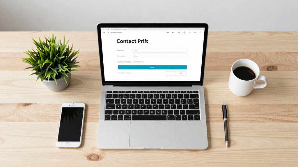
The look matters: a dull form kills trust and clicks
If your form looks like it’s from 2005, visitors will think your business is outdated. A clean, branded, and well-spaced form signals professionalism and builds immediate trust. Visual design influences perceptions of credibility—people tend to judge a business’s reliability based on how polished and modern its forms appear.
Adding whitespace around key elements, like the submit button, reduces visual clutter and guides the eye naturally, making the form easier to scan and complete. Small visual tweaks—like consistent fonts, aligned labels, and contrasting colors—can significantly improve user experience. These design choices communicate that you care about quality and professionalism, which in turn increases the likelihood of visitors trusting you enough to submit their information.
In essence, visual polish isn’t just cosmetic; it’s a trust-building tool. The better your form looks, the more confident visitors feel about sharing their details, which directly correlates with higher conversions.

Mastering Landing Pages – How to Capture Leads Without Coding : Included Software
As an affiliate, we earn on qualifying purchases.
As an affiliate, we earn on qualifying purchases.
Mobile users hate ugly, clunky forms
More than half of your visitors are on phones or tablets. If your form isn’t mobile-friendly, they’ll bounce faster than a ping-pong ball. Small input fields, dropdowns that require pinching, layouts that scroll sideways—these turn mobile visitors off instantly because they create friction and frustration.
Making your forms responsive means designing with touch in mind: large, easy-to-tap buttons, input fields that expand appropriately, and layouts that adapt seamlessly to different screen sizes. Testing your form on various devices ensures a smooth experience across all platforms. According to tests, a mobile-optimized form can increase conversions by up to 68%, because it reduces the effort required to complete the form on a small screen.
Prioritizing mobile design isn’t optional anymore; it’s essential. When your forms are easy to use on any device, you remove a major barrier, encouraging more visitors to convert rather than abandon your site.
How to turn your form into a lead-generation machine
Simple tweaks can skyrocket your results. Here’s a quick step-by-step:
- Break the form into smaller steps—one or two questions per screen—to reduce overwhelm and give users a sense of progress.
- Use conditional logic to show only relevant questions, which keeps the form concise and personalized, increasing completion rates.
- Add progress indicators so users see how close they are to finishing, which motivates them to complete the process.
- Ask only for essential info—start with an email, then ask for a phone number or additional details only if necessary, based on user responses.
- Design with clean visuals and ample whitespace to create a trustworthy, user-friendly interface that encourages submission.
Platforms like Delvasta make this easy. You can build multi-step, logic-driven forms in minutes and embed them anywhere, making your forms both smarter and more attractive.
Lead qualification: don’t waste your time chasing cold leads
If you want better leads, ask smarter questions. Use lead scoring to automatically sort prospects based on their responses—assign points for key indicators of high potential. High-scoring leads can be prioritized for immediate follow-up or booked directly, while lower-scoring ones can receive nurturing resources.
This method ensures your sales team focuses on the most promising prospects, saving time and increasing close rates. It also helps prevent burnout from chasing unqualified leads, allowing you to scale your efforts efficiently. The tradeoff is that implementing scoring adds complexity upfront, but the long-term gains in lead quality and sales efficiency make it worthwhile.
By integrating lead scoring into your forms, you create a smarter pipeline that actively filters and prioritizes prospects, turning your contact form into a true lead-generation engine rather than just a data collector.
The hidden cost of ignoring your form
Every day you keep a clunky, outdated form, you lose potential business. It’s like leaving money on the table—each abandoned form represents a missed opportunity that could have converted into revenue. Over time, these small leaks compound, significantly impacting your growth.
Investing a little time and resources to improve your form can have exponential returns. For example, reducing friction and increasing conversion rates by even 20% could turn 10 leads into 12 or 15, and so forth. The real cost of ignoring your form isn’t just the immediate lost leads but the cumulative effect on your pipeline and revenue. Quick fixes—like streamlining questions or enhancing design—are low-cost but high-impact, making them an essential part of your conversion strategy.
In sum, neglecting your contact form is a strategic mistake that hampers growth. Addressing it offers a clear ROI—more leads, more sales, and a healthier bottom line.
Ready to make the switch? Here’s what to look for
Don’t overhaul your entire site overnight. Instead, focus on selecting platforms that empower you to build advanced, user-friendly forms with minimal effort. Features to look for include:
- Multi-step layouts that split questions into manageable screens, reducing perceived effort.
- Conditional branching that dynamically shows or hides questions based on previous answers, increasing relevance.
- Built-in lead scoring and analytics to help you evaluate and optimize form performance.
- Seamless integration with your CRM and email marketing tools for streamlined follow-up.
- Mobile-first design ensuring your forms look and work perfectly on any device.
Tools like Delvasta are designed with these features in mind, enabling you to create high-converting forms quickly and easily, without technical headaches.
Frequently Asked Questions
How many form fields should I use?
Keep it under five fields unless you’re pre-qualifying high-ticket leads. The fewer, the better—especially for initial contact forms. Ask only for what’s necessary to start the conversation.
Should I ask for a phone number?
Only if you truly need it. Making it optional and clear about why you want it can boost completion rates by over 50%. If you don’t need it immediately, skip it.
What info is actually necessary?
Just an email address is often enough to start. Add more info only if it helps qualify the lead or speeds up your sales process. Over asking kills your chances.
How quickly can I see results?
Even small changes like removing a field or adjusting layout can show results within days. A/B testing different versions helps identify what works best for your audience.
What’s the biggest mistake businesses make with forms?
They treat forms as an afterthought or a necessary evil. Instead, see them as a core part of your conversion strategy. Simplify, personalize, and optimize for mobile—you’ll see the difference.
Conclusion
Your contact form is more than just a data collector—it’s the final chance to turn a visitor into a customer. Small tweaks like reducing fields, adding steps, and improving design can change your conversion game overnight.
Don’t let an outdated form keep your sales pipeline empty. Take action now—your next big client might be just one smart form away.